 028 6862 1766
 sales@petal.co.uk


Colour Advice for Wow Factor Washroom Installations
When approaching the design of washrooms for premium venues, commercial offices, schools or leisure facilities, colour selection is of pertinence in achieving the desired look and feel for your project. Gone are the days when washrooms for public buildings served merely a functional purpose. Herein lies your opportunity to create a wow factor for users and where colour is concerned, this can be achieved without adding additional budget to your project. Whether your mood board suggests natural woodgrains or a pop of vibrant colour, Petal’s vast colour range will guide you to the ideal choice for each element of your installation.
Think ‘user’ first
As with all design briefs, the primary consideration when addressing colour palettes for washroom settings should be the end user.
In a Commercial Retail setting, you’ll want warm and welcoming colours to help inspire confidence and ensure customers’ desire to return again and again. The cool blues and earthy greens of this case study at Blanchardstown Shopping Centre are complemented beautifully by the oak cubicle doors and bright white vanity troughs.


Commercial Office Space designers should also carefully consider their users. In this modern era, very often office workers have spent a prolonged period working from home and part of client design briefs are centred around driving people back to the office – creating beautiful spaces that people want to come back to. Use colour to create a ‘home from home’ feel rather than a stark industrial feel. Woodgrains are a popular option for commercial offices – from darker options like Wenge and Graphite grey through to light oaks, these can all be enhanced with complementing wall and floor colour options to achieve a premium yet welcoming vibe.
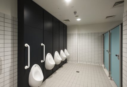
For Educational settings, a world of colour options presents, and this is where you can really stretch the imagination. For younger, toilet shy pupils, a bright welcoming environment is pertinent. Not only does this help to alleviate anxiety, especially in those early days of settling in, but it can also help encourage personal hygiene and promote toilet independence – all very vital skills in early childhood development. Choose primary colours – from Chrome Yellow to Spectrum Red, there is a world of choice in Petal’s Colour Collection at your disposal.
However, don’t think that secondary or third level education washroom design should revert to being ‘drab’. Here is your opportunity to enhance pupils’ school experience dramatically. Unfortunately, graffiti and vandalism in later school years is a major problem. Avoiding mundane colour palettes in washroom areas can help instil pride and give students a space they can be proud of and therefore less likely to damage. Check out the beautiful pastel palette of St Catherine’s Girls’ Boarding school and the contrasting greens of Freeman’s School for inspiration.


For Sports Clubs, incorporating club colours is a striking option and can help cement pride in the club and the sense of belonging that a club brings. The powerful Red of the Ulster Rugby club’s colours was impressively engaged for their locker room – what a way to brand any club changing area.

The Full Picture
Whilst choices for cubicle, vanity, locker and bench options will contribute significantly to a washroom colour scheme, they must be considered in the wider palette of the whole scheme, so here are some nuggets as to how to strike the perfect look for your design.
-
Floors and Walls
Stone tiles will create an earthiness for your venue and larger tiles will create a spacious feel, but keep these spaces neutral in colour to achieve your statement elsewhere. Wall tiles are the ideal space in which to strike a colour chord so ensure to work with different colours for your walls and floors to leave a lasting impression. Look at these examples from UCD James Joyce Library and 1 Le Pole Dublin for inspiration.


-
Hardware
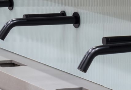
Very often even the most tasteful washroom design can come unstuck when it comes to hardware. Ensure you choose the finishing touches sensitively to complete your desired outcome. Chrome or powder coated black achieves a striking contrast to light coloured surfaces. Stainless steel, brass and bronze contribute to that earthy feel. For pure opulence choose gold – this brushed gold panelling at 1 Le Pole Square, Dublin, achieved one of the most impressive cubicle interiors Petal has installed in its over 40 years of business.


-
Mirrors and Lighting
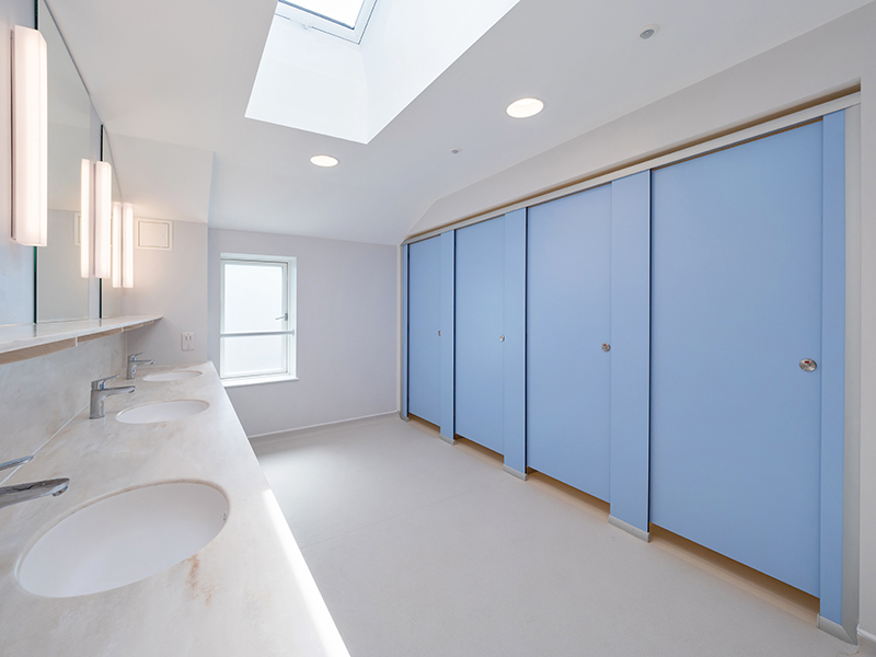
Once your colour scheme is finalised, make sure it can be seen effectively. Mirrors can help create an ambience and contribute to the overall feeling of space. Behind mirror lighting, top lighting and LED options all enhance the experience at a vanity unit and enhance the colour schemes that surround.

Petal’s Mirror Housing unit with its backlit options creates the most seamless user experience. Or choose bespoke mirror options such as this oval shape specified for this university library for something a little different.

Where natural light is lacking in your washroom area, you can afford to be more bold with colour and lighting options – and do so without being garish or brash.
To Conclude: Make a Statement
To sum up our advice: Use colour with confidence to make a statement. Whether adopting a neutral palette or a bright ‘wow factor’ option, your washroom colour choice can create a standout feature for the overall scheme, rather than one that hides away in the background. Where positive user experience is the end goal, embrace colour to help achieve this goal, and we guarantee your client will be impressed with the results.
To explore the full colour range from Petal, view our Surface Choice collections here.